Designing transparent technology
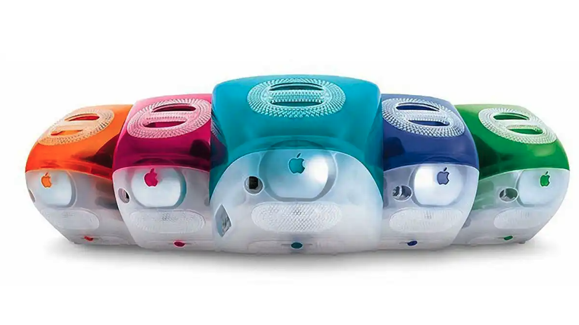
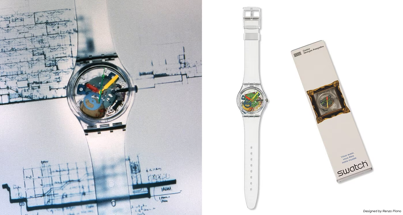
In the realm of technology and design, the late 1990s marked a significant cultural and aesthetic shift. The introduction of devices like the Apple iMac G3 with its translucent shell not only represented a leap in material technology but also symbolised a desire for transparency and understanding in an increasingly complex world. These transparent designs were more than a mere fashion statement; they were a physical manifestation of a deeper societal longing — to see and understand the inner workings of the technology that was becoming central to our lives.
Just as the transparent casings of the 90s provided a glimpse into the physical heart of our devices, there is a growing demand for transparency in the digital algorithms and systems that influence and control much of our daily lives.It reflects a broader human desire for clarity, understanding, and trust in the technologies we use.
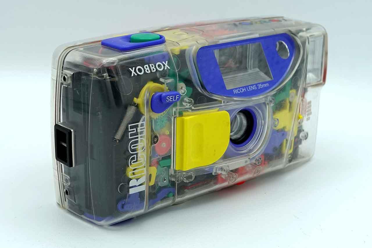
With A.I and our devices, there’s a growing demand for transparency from our technology — a pressing need to understand how they influence and often control our lives. Ironically, many of these systems and devices we’ve now created are literally black boxes. In the 90s, the advancements in polycarbonate materials allowed for the creation of durable yet translucent plastics, granting designers unprecedented flexibility. Such transparent designs were more than a trend — they showcased the elegance of underlying printed circuit boards and components, turning products into artistic masterpieces. Moreover, on a philosophical level, by revealing the inner workings, companies like Nintendo with their Game Boy Color projected a message of authenticity and integrity in their products.


As we moved into the 21st century, the trend in physical product design shifted towards minimalism, paralleling a similar trend in digital design. This minimalist approach, while aesthetically pleasing and often user-friendly, has led to a veneer of simplicity that masks the complexity beneath.
The minimalist design trend and its implications
Now in the digital world, user interfaces and systems are so seamless and integrated into our lives that their true nature and operations remain hidden. This lack of transparency in digital systems, especially in AI, raises concerns about privacy, ethics, and control.
In this era of simplicity, not only has product design become monotonous, but as technology grows intricate, we’ve cocooned ourselves from its complexity. Adopting a ‘less is more’ mantra, we’ve masked the convoluted nature of systems to the point we now have devices and systems that seamlessly integrate into our lives. We’ve designed them to fool ourselves of how human they are and have made them intrinsic to our lives. The previous generation of translucent designs transcend superficial aesthetics — they serve as poignant reminders of our unique humanity amidst the sprawling maze of technology. A reminder that we are still working and talking to a collection of bits and PCB.
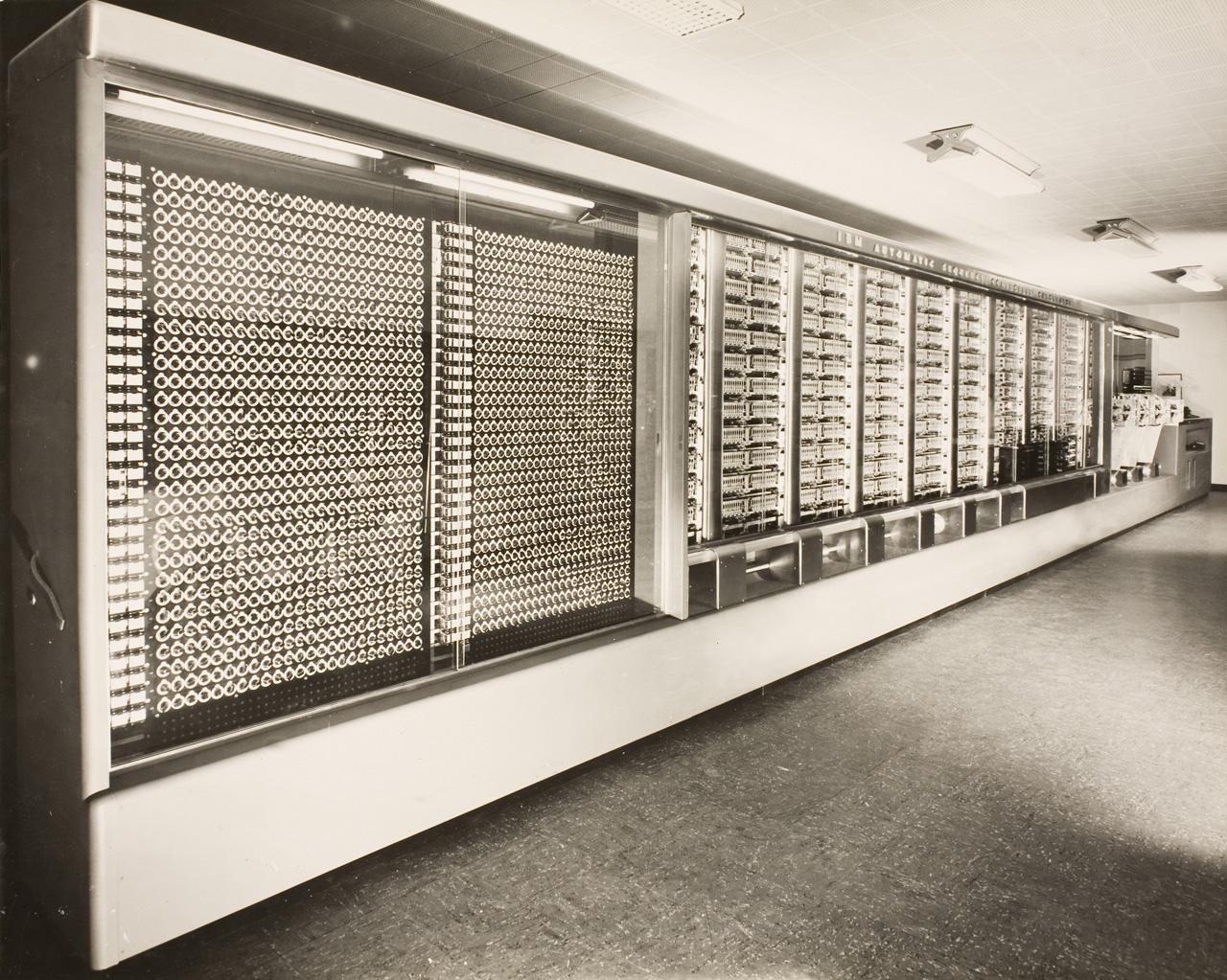
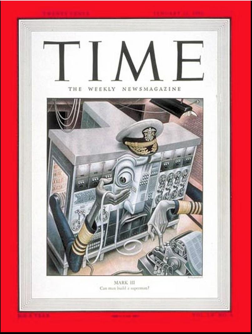
The evolution of computer design reflects a fundamental shift in how we interact with and perceive technology. In the earliest days of computing, machines like the Harvard Mark I represented a tangible, mechanical approach to processing information. This colossal machine, stretching 51 feet long and standing 8 feet high, was a marvel of its time, composed of over 750,000 components including switches, relays, and rotating shafts.Its operations, while complex, were physically manifest — a symphony of mechanical movements and blinking lights that directly corresponded to the binary nature of its computations.
The blinking lights and audible clicks of these early machines provided users with a direct, albeit rudimentary, understanding of the computing processes. The Harvard Mark I, for instance, was revered for its capabilities, as noted in a 1950 Time Magazine article that likened its problem-solving prowess to the Oracle of Delphi — a testament to both its complexity and the awe it inspired.
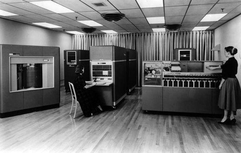
However, as technology progressed, the design philosophy shifted. The advent of IBM’s Model 650, the company's first mass-produced computer, marked a transition to more compact, efficient, and user-friendly designs. The 650, popular in universities, was a critical step in democratizing computing, making it accessible to a broader audience and influencing a generation of programmers. This shift was not merely about reducing size but also about changing the relationship between the user and the machine. The intricate, visible workings of machines like the Harvard Mark I gave way to enclosed, streamlined designs that prioritised user experience over mechanical transparency.
Transparency-focused approaches
Today's devices, while aesthetically pleasing, often leave users detached from the understanding of the fundamental workings of technology. This detachment raises concerns about our ability to truly grasp the impact and extent of technology in our lives. As we integrate technology further into our everyday lives, the responsibility falls on designers and developers to prioritise transparency. This means moving beyond minimalistic interfaces and creating experiences that educate and empower users.
This evolution in design philosophy presents a unique challenge and opportunity for contemporary designers and developers. The question now is: How can we reintegrate the fundamental principles of technology, such as its binary nature, into modern design in a way that is both informative and appealing? One approach could be the integration of interactive elements in devices that subtly reveal their binary operations. For example, a smartphone could have a feature that, when activated, visually represents its computing processes in real time. Another approach could be through educational initiatives embedded within technology products, like interactive tutorials or augmented reality experiences that visually demonstrate how code translates into the functions and applications we use daily. By incorporating these elements, designers can bridge the gap between the hidden complexities of modern technology and the user's understanding, fostering a deeper appreciation and awareness of the digital world.
However, achieving this balance between aesthetic minimalism and informative transparency is challenging. The market pressures and prevailing design philosophies favor sleekness and simplicity. In the digital realm, this translates to user interfaces that prioritise ease of use and aesthetic cleanliness, often at the expense of revealing the complex processes underneath. This minimalist trend is not just an aesthetic choice but a reflection of broader consumer expectations for streamlined, frictionless experiences. Yet,as public discourse around the ethical implications of technology grows, there may be a shift in consumer attitudes, creating a demand for products that offer deeper, more informative experiences.
The future
Reintroducing elements of transparency — whether in the physical design of gadgets or the digital interfaces of apps — goes against the grain of current design norms and market expectations. It requires a bold rethinking of what users value and a willingness to educate the market about the benefits of understanding the technology they use daily. Bridging this gap between minimalism and transparency is a delicate balance that challenges the status quo, demanding innovation and foresight from today's designers and developers.

Envisioning the future of technology design is akin to watching the gentle revolutions of a turntable. As the turntable spins, each revolution brings with it echoes of the past and hints of the future. Each rotation is not just a moment passing; it's a cycle returning. What began as a trend in the late 1990s wasn't a fleeting whim but a profound statement about our ongoing relationship with technology. It reminds us that the ideas and principles of transparent design are not lost to time but are continually revisited and reinvented in our quest for understanding and clarity. It invites us to engage, understand, and appreciate the harmony of our digitally intertwined existence.
In this way, the future of technology design is not a linear path but a series of returning cycles, each informed by the last. It's a future where the principles of transparent design continue to resonate, guiding us toward a more informed, ethical, and transparent relationship with the technology that permeates our lives. As the turntable spins, so does our collective understanding, ever deepening, ever evolving, in the beautiful rhythm of progress.